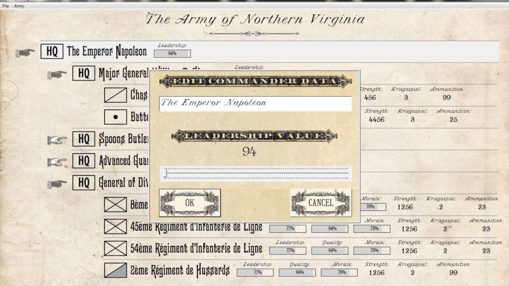
We need your feedback about the typography used for editing units in the Order of Battle (OOB) table. In the first example (below) we would like to ask if the typeface for ‘Edit Commander Data’ and ‘Leadership Value’ is legible for you. This font is called ‘Phectic’.

Screen shot from the General Staff Army Design Module Order of Battle table. Do you think the type for ‘Edit Commander Data’ is legible or not? Click to enlarge.
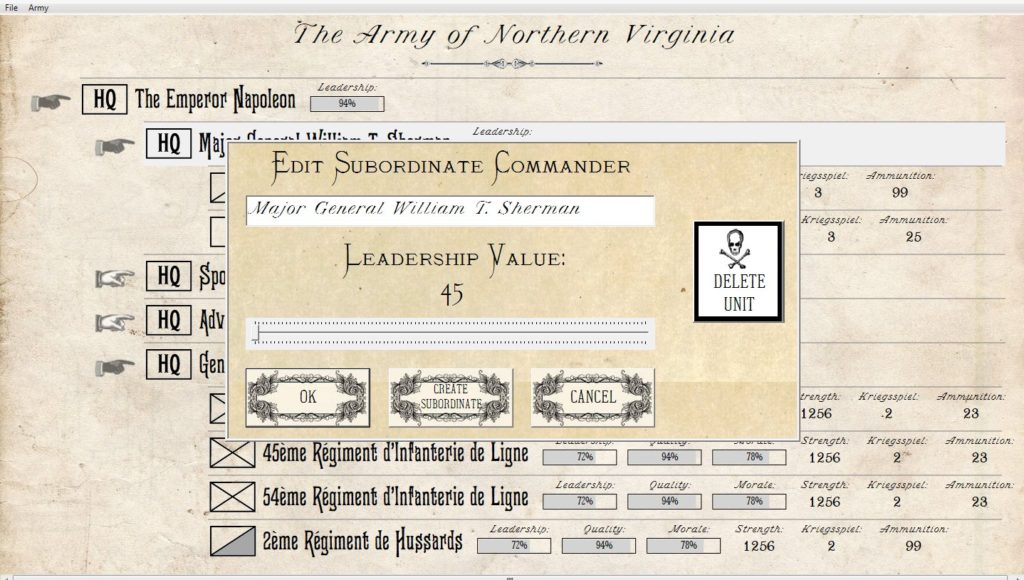
Below is the alternate typography which is currently being displayed for editing the subordinate commander data. This font is called “Monastic”;

Screen shot from the General Staff Army Design Module Order of Battle table. Do you think the type for ‘Edit Subordinate Commander and ‘Leadership Value’ typeface is more legible than the above display? This font is called ‘Monastic’ Click to enlarge.
Our overarching design goal has been to create a wargame with an ‘authentic Kriegsspiel‘ look. If they had computers in the 19th century what would the design look like? Phectic by the way, is from Walden Font Company’s, “The New Victorian Printshop, Volume One.” Walden has done a fantastic job in finding, scanning and digitizing old typefaces (including a series of the American Civil War that I used on a previous project). A link to their site is here.
Please take a few seconds and answer the survey question below:
[socialpoll id=”2415748″]

I also have a harder time reading Phectic. I admit that I feel it’s more appropriate, though. If you had a third choice that looked like Phectic but had slightly thicker lines, that would win for me.
Thanks for the feedback. I will find a place to use Phectic but in a much larger point size.
I really like the Phectic look, but it is very difficult to read (and thus voted for its competitor). Cheers.
I keep coming back to the class I took in typography many years ago. Legibility is most important.
I didn’t think I would, but when I had a closer look at it, I ended up like Phectic more. Like you, I think it has more of a “period feel.” Not that either will really bother me.
Thanks for the comment! It’s really appreciated.
The deciding point on this issue was that I found it very hard to read light/white letters on black background in the Phectic style. The other headings With plain black on light background was much easier to read.
First, thanks for helping me with this decision. I really appreciate it.
I have to admit that I was drawn to Phectic because it is so authentic. However, I was concerned that was ‘too over the top’. But, I’m also really drawn to the Steampunk genre which is basically asking the question: if they had computers in the 19th century what would the graphical user interface (GUI) look like?