Last week we ran a quick survey to get your opinion on the legibility of two Victorian typefaces (see here). The clear favorite was the font ‘Monastic’ garnering 73% of the votes. However, we also received numerous personal emails and comments from grognards that were also very fond of the Phectic font. The decision was made to go with Monastic but to use Phectic in a larger point size when appropriate.
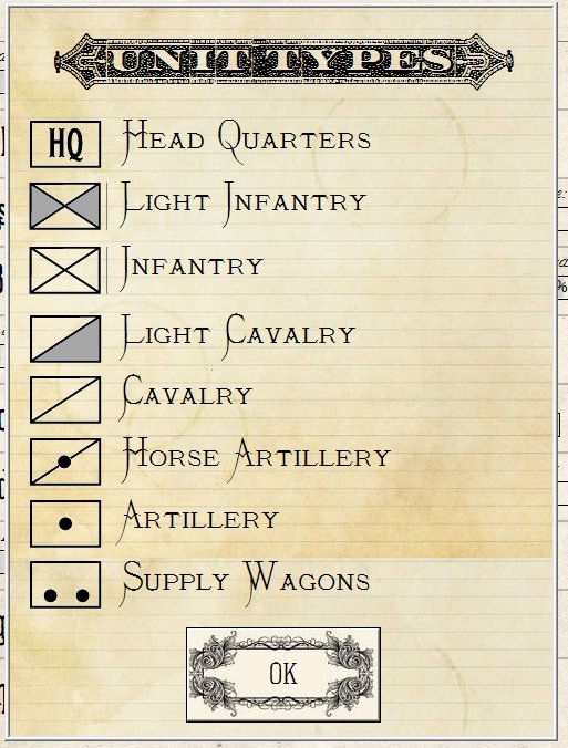
Below is a screen shot of how we will be using Phectic:
Your comments were greatly appreciated (it was especially enjoyable to hear from a letterpress operator who fondly remembered metal type). The interactive Army Design Module is almost completed and we will be posting a video of it shortly.

