Tag Archives: Game design

Introducing a New Generation to Wargames

My childhood friend, Carl Hoffman, introduced me to Avalon Hill wargames. Carl is now a history teacher.

It was my good friend, Carl Hoffman, who lived across the street when I was about 10, who introduced me to Avalon Hill (AH) wargames. The AH wargames of the 1960s were perfectly suited to spark a kid’s imagination. The rules were easy to understand (four pages, big type, with illustrations explaining movement and combat), the Combat Results Table (CRT) was straightforward (and taught us to calculate ratios, too), and we could refight Gettysburg or Waterloo on a rainy afternoon. We learned history (Carl became a history teacher) and problem solving (I became a computer scientist). I’m sure many of us had similar experiences forty or fifty years ago.

For a long time I’ve felt that there is a need for similar ‘introductory wargames’ to engage the next generation of grognards and wargamers. While the hardcore aficionados want more complex and detailed games I’ve also understood that we needed simple, introductory games, to entice a new generation.  From the beginning, I have always had a simpler wargame embedded inside of General Staff. Specifically, if we remove all the layers of historical simulation, what remains is a simple introductory wargame.

The Layers of Historical Simulation in General Staff

Each layer of historical simulation can be turned on or off when playing a General Staff scenario. The more options you add, the more historically accurate the simulation becomes. The options are:

  1. Unit strength
    1. Unit strength is a value from 1 – 4 with units being reduced in steps.
    2. Unit strength is the actual historic number of troops and every individual casualty is tracked.
  2. Combat resolution
    1. Simple Combat Resolution Table like the old AH CRT.
    2. Complex Combat Resolution Equation taking into effect morale, experience, leadership, terrain, and elevation.
  3. Moving units
    1. Units are moved directly by the player.
    2. Orders to move units are issued down a chain of command from the top HQ to the subordinate HQ via couriers and the rapidity with which the orders are executed depends on the Leadership Value of the subordinate HQ and subordinate units.
  4. Fog of War (FoW)
    1. No Fog of War. The entire map is visible and all units (friend and foe) are displayed on it.
    2. Partial FoW. The entire map is displayed and the sum of what all friendly units can see is displayed.
    3. Complete FoW. You see only what the commander can see from his HQ and nothing else. All unit positions not directly observable are updated via couriers and are frequently no longer accurate by the time the courier arrives.

So, at it’s most complex (let’s call this a Historical Accuracy level of 100%) this is what the player commanding the Army of the Potomac (Blue) would see (what General George McClellan could actually see through his telescope on the lawn of the Pry House on the morning of September 17, 1862):
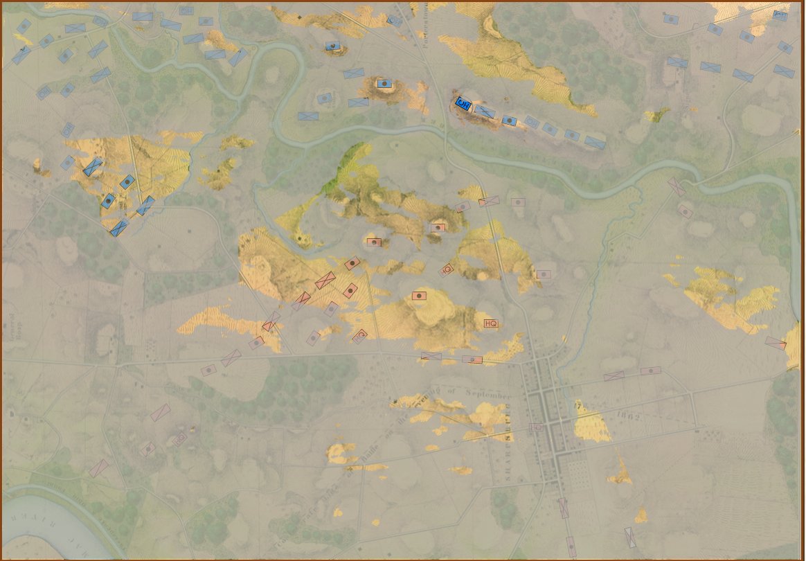
Antietam from the perspective of General George B. McClellan at the Pry House on the east bank of the Antietam Creek. This is complete Fog of War and the highest level of historical accuracy. Screen shot. Click to enlarge.

And, interestingly, this view of what McClellan could see is confirmed in The U. S. Army War College Guide to the Battle of Antietam and The Maryland Campaign of 1862 edited by Jay Luvaas and Harold W. Nelson.”General McClellan and his headquarters staff observed the battle from the lawn of the Pry House… Through a telescope mounted on stakes he enjoyed a panorama view of the fighting… He could see Richardson’s division break through the Confederate position at the Bloody Lane. He could not, however, follow the movements of the First and the Twelfth Corps once they disappeared into the East Woods, which masked the fight for the Cornfield, nor did he witness the attempts to seize Burnside’s bridge to the south because  the view from the Pry House was blocked by trees and high ground.” – p. 119.

So, the above is the 100% historically accurate view of the battle of Antietam from McClellan’s Headquarters. This is the ‘introductory’ view:
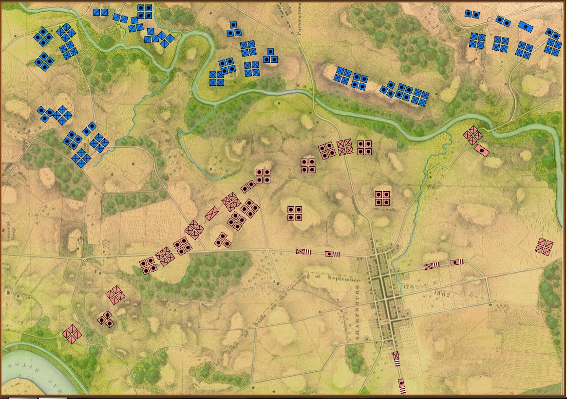
Antietam in ‘Introductory’ mode. Note that unit strengths are represented by one to four icons. Also note the lack of HQs. Screen shot. Click to enlarge.

I first saw the concept of ‘unit steps’ in Jim Dunnigan’s Avalon Hill classic, 1914 and I’m shamelessly using it here. I very much like the simplicity of this system: as units take casualties, they are reduced, in steps, from four icons, to three, to two, etc. I also very much like the idea that this is not an abstraction of the battle of Antietam (or Little Bighorn, or Quate Bras, etc.) but the actual units in their actual locations. This fulfills my requirements for an introductory wargame: historic, teaches tactics and problem solving, easy to play, simple rules, quick to learn and quick to play (I would think a game could easily be played in less than an hour).

Here are some more General Staff scenarios in ‘introductory mode’:

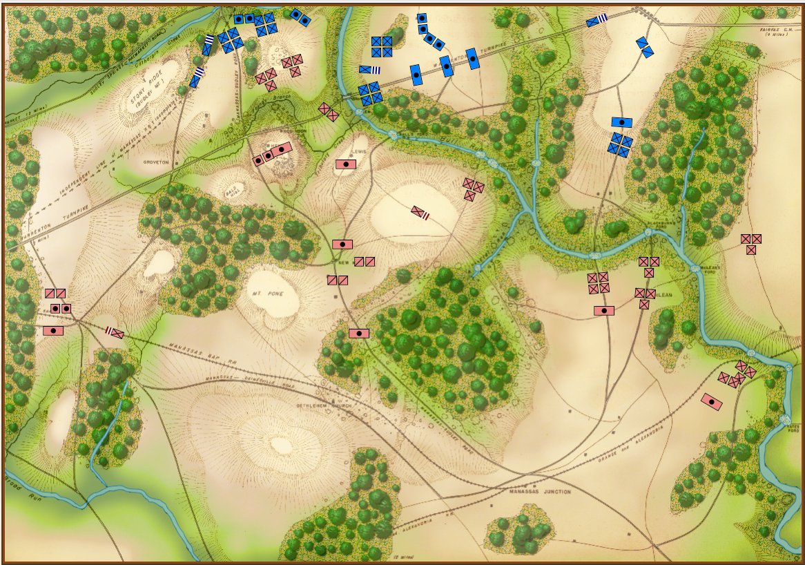
1st Bull Run, 11:30 hours, ‘introductory’ mode. Screen shot. Click to enlarge.

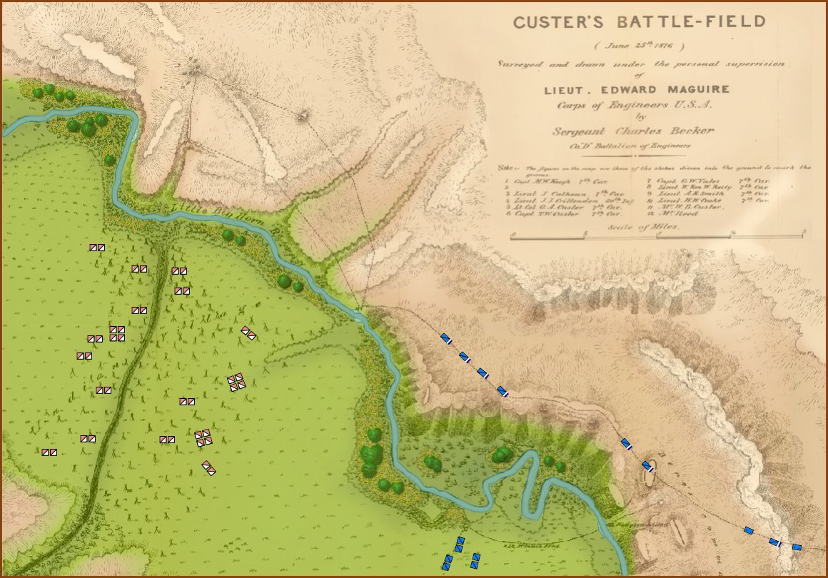
Little Bighorn in ‘introductory’ mode. Screen capture. Click to enlarge.

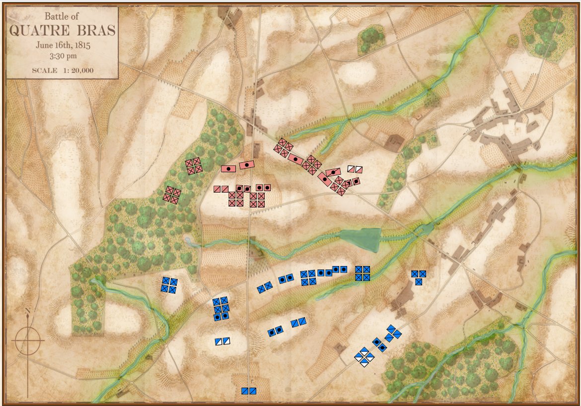
Quatre Bras in ‘introductory’ mode. Screen capture. Click to enlarge.

I could use your help! Announcing a ‘name the mode’ contest!
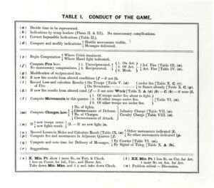
From ‘The American Kriegsspiel. Clicking on this image will take you to the Grogheads.com article on William Livermore’s American Kriegsspiel.

I originally called ‘introductory’ mode, ‘Kriegsspiel’ mode because I was reminded of the maps and blocks that Kriegsspiel uses. However, I pretty quickly received some emails from the Kriegsspiel community complaining – and rightfully so – that Kriegsspiel isn’t an introductory game. Absolutely! And if you’ve ever taken a look at the original rule books and tables you would agree, too.

So, here’s my problem (and how YOU can help): I need a new phrase to replace ‘Kriegsspiel mode’. I’ve been using ‘Introductory mode’ but I just don’t like it. I really need a new name for this version. I’m open to any suggestions. How about a completely made up word? ‘Stratego’ would be great if it hadn’t already been used. So, I’m announcing a contest to ‘name this mode’. The winner will receive 2 General Staff coffee mugs. Please email me (Ezra@RiverviewAI.com) with you suggestions. Thank you for your help!

The Problem With Hexagons

Hexagons are ubiquitous in wargames now (indeed, both Philip Sabin’s War: Studying Conflict Through Simulation Games and Peter Perla’s The Art of Wargaming feature hexagons on their book covers), but this wasn’t always the case. My first wargame – the first board wargame for many of us – was Avalon Hill’s original Gettysburg  (by the way, $75 seems to be the going price for a copy on eBay these days).

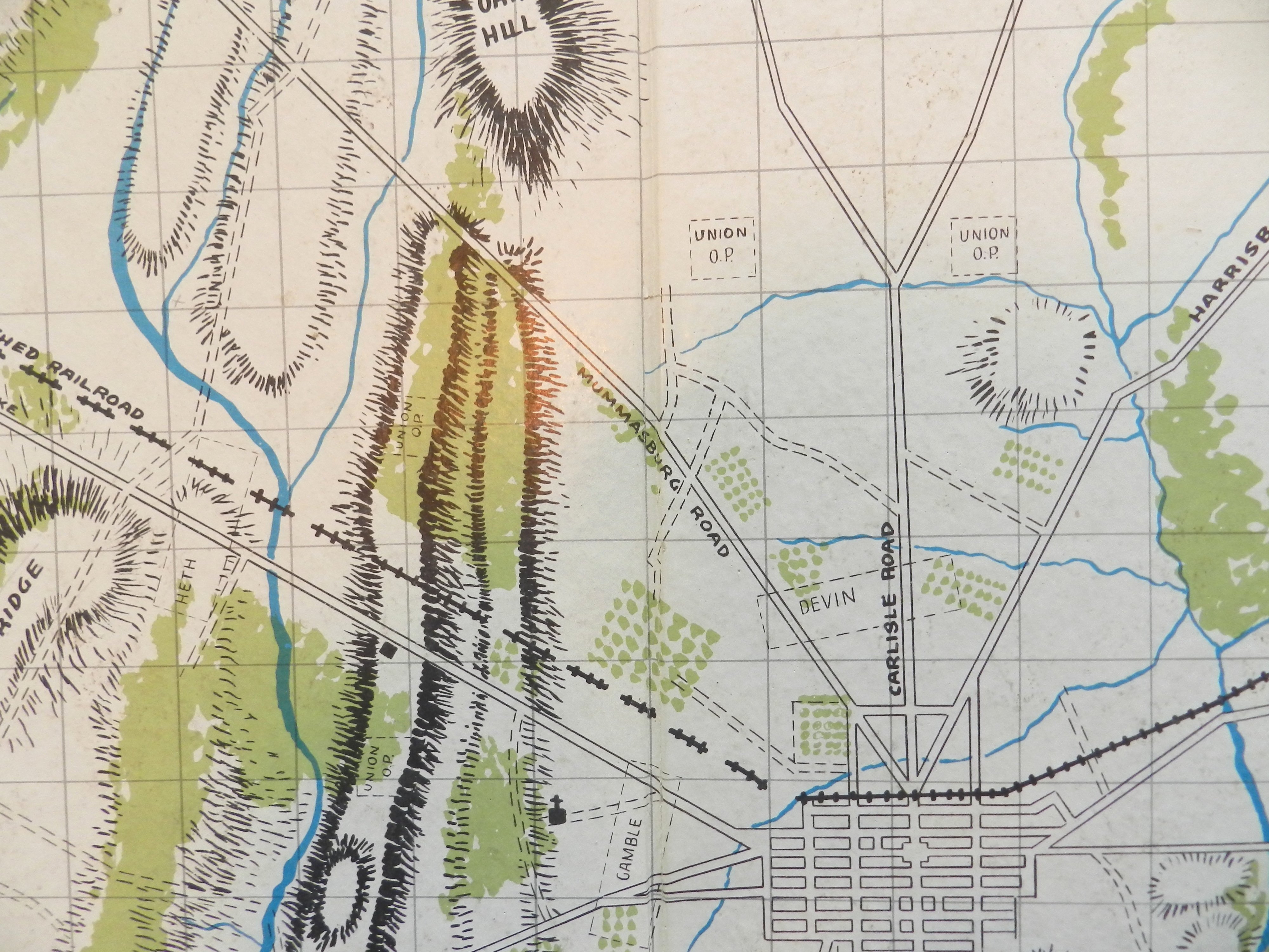
No hexagons in Avalon Hill’s original Gettysburg. Remember how the map contained the original starting positions for the Union cavalry and out posts? From author’s collection. (Click to enlarge)

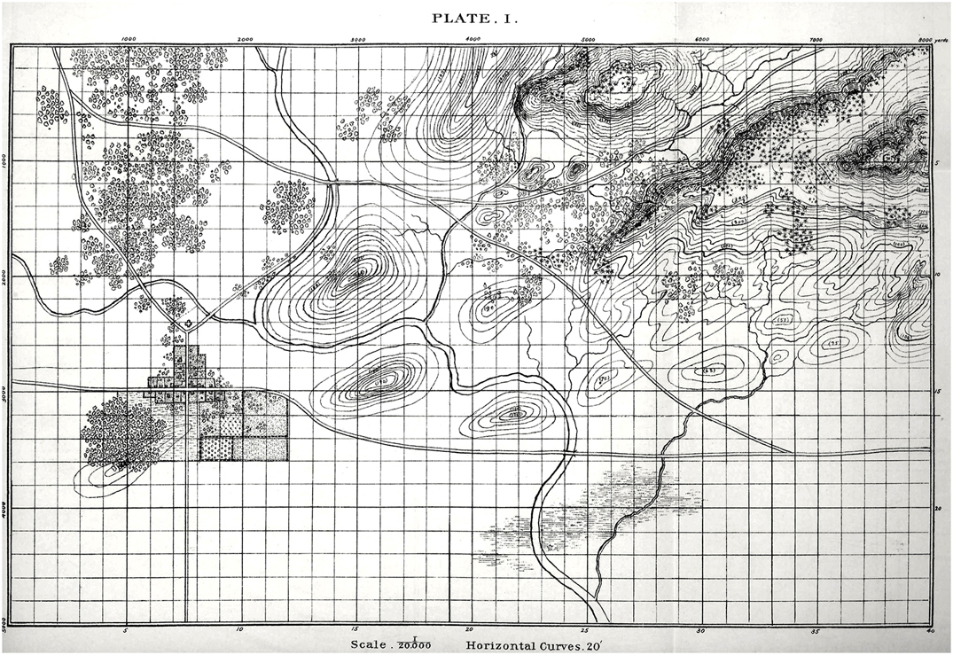
The American Kriegsspiel by Captain Livermore (circa 1882) only had a map grid for estimating distances. We also have a map grid in General Staff to facilitate estimating distances but you can turn the map grid on or off.

Plate 1 from The American Kriegsspiel by Captain Livermore. Click to enlarge. This image is from GrogHeads wonderful blog post on Nineteenth Century Military War Games. Link: http://grogheads.com/featured-posts/5321

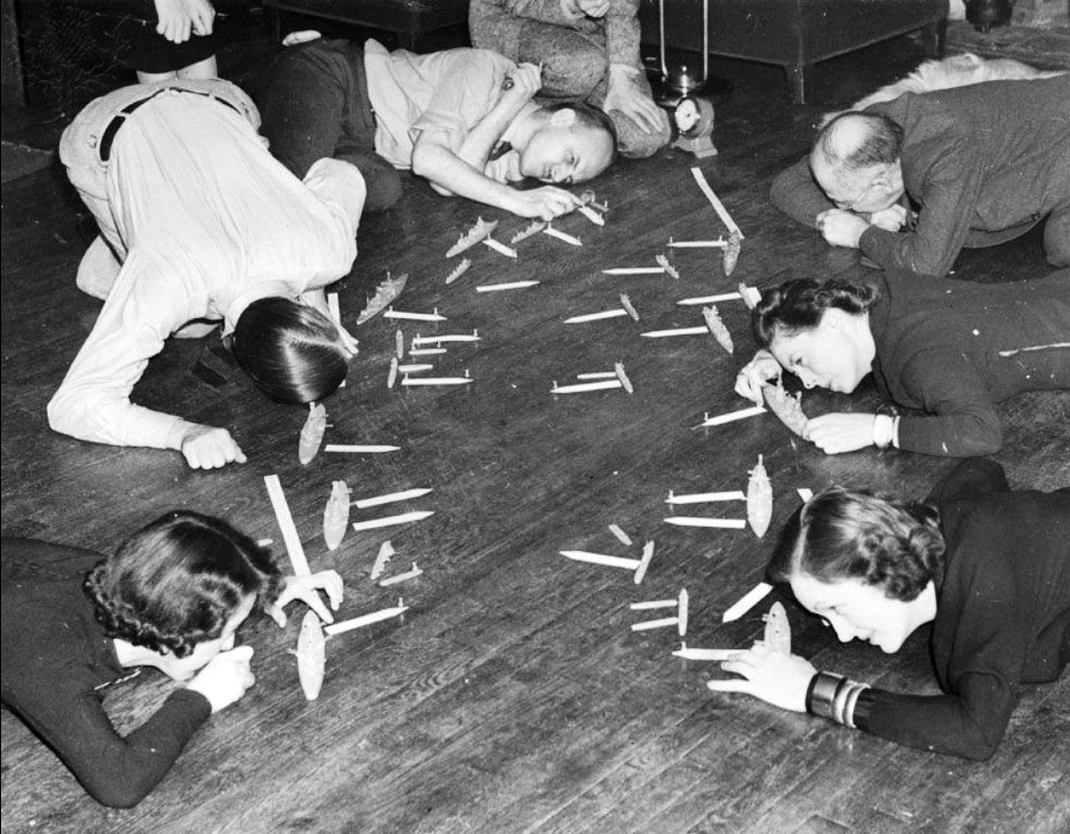
And how about this picture from the Naval War College (circa 1940s)? I just needed an excuse to post this photograph:

A Fletcher Pratt Naval War Game in progress. I never understood why they didn’t use upside down periscopes to check broadside angles rather than getting down on the floor. Click to enlarge. From this blog http://wargamingmiscellany.blogspot.com/2016/02/simulating-gunfire-in-naval-wargames.html

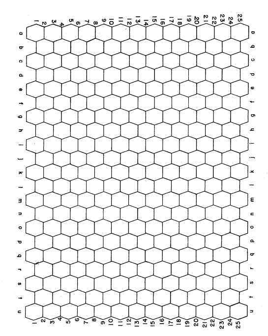
It is pretty common knowledge among the wargaming community that Avalon Hill’s owner, Charles Roberts, introduced hexagons to commercial wargaming in the early 1950s .

“Later, he [Roberts] saw a photograph of one of the RAND gaming facilities and noted they were using an hexagonal grid. This grid allowed movement between adjacent hexagons (or hexes, as they are more frequently called) to be equidistant, whereas movement along the diagonals in a square grid covered more distance than movement across the sides of the squares. Roberts immediately saw the usefulness of this technique and adopted to his subsequent games.”

The Art of Wargaming, Perla, p. 116

In researching how the RAND Corporation – a major post-war defense think tank – came up with the original idea of employing hexagons to simplify movement calculations (as well as the invention of the Combat Resolution Table or CRT) I stumbled upon an amazing document: Some War Games by John Nash and R. M. Thrall (Project RAND, 10 September 1952; available as a free download here). Yes, that is THE John Nash; A Beautiful Mind John Nash; the Nobel Prize recipient John Nash. The Some War Games summary states:

“These games are descendants of the one originally instigated by A. Mood, and are both played on his hexagonal-honey comb-pattern board. – Some War Games Nash & Thrall.

But what appears on Page 1A of Some War Games is even more exciting:

The earliest reference of using hexagons for wargames. “The board is a honeycomb pattern of hexagonal “squares,” the same that was used in Mood’s game” – From Some War Games (Project RAND, Nash & Thrall).

Sadly, I have been unable to find an actual copy or documentation for “Mood’s game,” but did discover that A. Mood was a statistician who wrote the popular text book, “Introduction to the Theory of Statistics,” and, during World War II was involved with the  Applied Mathematics Panel and the Statistical Research Group. Mood was also the author of, “War Gaming as a Technique of Analysis,” September 3, 1954 which is available as a free download here. Unfortunately, I have yet to uncover any images of Mood’s original war game and the very first use of his ‘honeycomb pattern’ board.

Let’s take a quick look at the math behind hexagons:

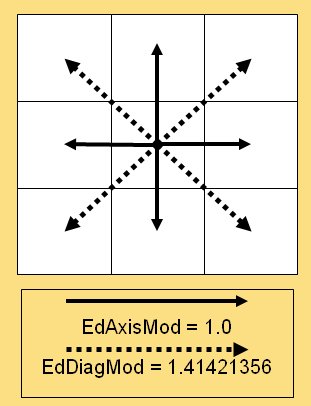
The cost of moving diagonally as opposed to horizontally or vertically on a map board (from a slide in my PhD Qualifying Exam on least weighted path algorithms).

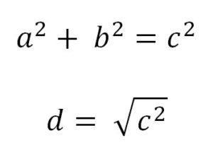
The problem of quick and easy movement calculation (as shown in the above graphic) is caused by the Pythagorean Theorem. Well, not so much caused, as a result of the theorem:

The distance to a diagonal square, d, is the square root of the square of the hypotenuse (the side opposite the right angle) which is equal to the sum of the squares of the other two sides. We all learned this watching the Scarecrow in the Wizard of Oz, right?

In other words, if everybody could just multiply by 1.41421356 in their heads we wouldn’t even need hexagons! The downside, of course, is now we’ve restricted our original eight axes of movement to six. And there’s another problem; what I call the, “drunken hexagon walk.”

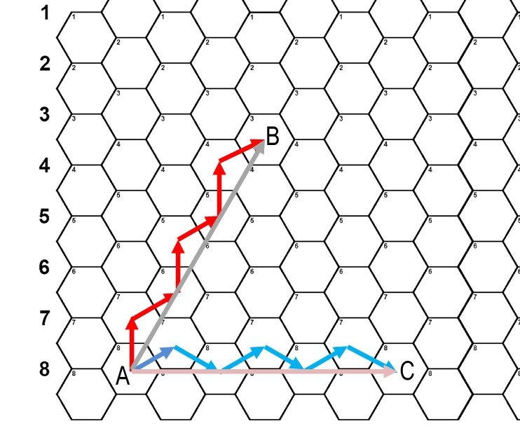
An example of “drunken hexagon walk” syndrome. All we’re trying to do is go in a straight line from Point A to Point B and from Point A to Point C.

In the above diagram we just want to travel in a straight line from Point A to Point B. It’s a thirty degree angle. What could be simpler? How about traveling from Point A to Point C? It’s a straight 90 degree angle. It’s one of the cardinal degrees! What could be simpler than that? Instead our units are twisting and turning first left, then right, then left like a drunk stumbling from one light post to another light post across the street. In theory the units are actually traversing considerably more terrain than they would if they could simply travel in a straight line. This is the downfall of the hex: sometimes it simplifies movement; but just as often it creates absurd movement paths that no actual military unit would ever take.

So, what’s the solution? Clearly, there is no reason why a computer wargame should employ hexes. Computers are very good at multiplying by 1.41421356  or any other number for that matter. Below is a screen shot of General Staff:

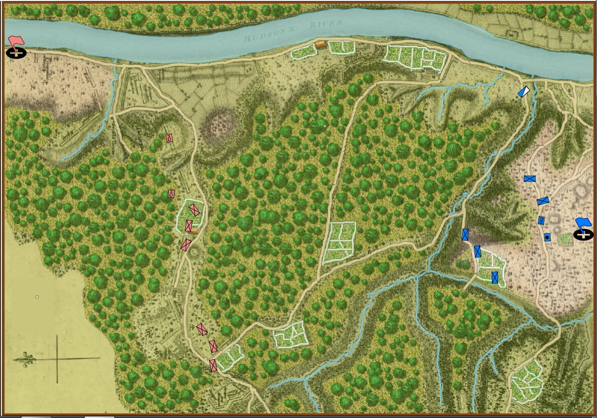
Screen shot of General Staff (2nd Saratoga) based on the map of Lt. Wilkinson, “showing the positions of His Excellency General Burgoyne’s Army at Saratoga published in London 1780)  . Click to enlarge.

What’s missing from the General Staff screen shot, above? Well, hexes, obviously. Units move wherever you tell them to in straight lines or following roads precisely if so ordered. And units can obviously face in 360 degrees. Consider this screen shot from the General Staff Sandbox where we’re testing our combat calculations:

Screen shot from the General Staff Sandbox. Notes: 3D unit visibility is turned on, displayed values: unit facing, distance, target bearing, enfilade values, target offset. Click to enlarge.

For board wargames hexagons seem to be a necessary evil unless you want to break out the rulers (that never stopped us with the original Gettysburg or Jutland). But, when it comes to computer wargames, I just don’t see the upside for hexagons but I do see a lot of downside. And that’s why General Staff doesn’t use hexes.

Map Editor Now Supports Vector Graphics, Multiple Drawing Layers and Drawing Tablets!

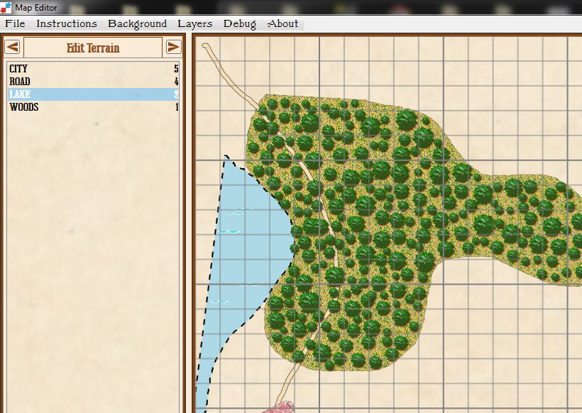
Screen capture showing support for multiple drawing layers and vector graphics in the Map Editor. Click to enlarge.

Normally, following game development is about as exciting as watching paint dry. I should know as I’ve created a good number of games and I’ve painted my fair share of walls. But, I am completely blown away by the enhancements that Andy O’Neill has made to the General Staff Map Editor. The above screen capture of the Map Editor shows just a few. Andy has added support for Microsoft Windows Ink which includes support for drawing tablets and styluses.

The Map Editor now also uses multiple drawing layers (just like PhotoShop). This allows for infinite levels of undo. In the above screen capture you can see how the road snakes through the forest. And, speaking of the forest, Andy’s new ‘tree algorithm’ looks fantastic (when you draw a forest the trees magically grow before your eyes).

If you would like to follow along with the new developments, Grogheads has kindly given us a space on the forum for posting updates: http://grogheads.com/forums/index.php?topic=21270.0. There are now four pages of updates and screenshots. Please feel free to drop by, take a look and post a comment or request a feature.

A Wargame 55 Years in the Making

I was introduced to wargames (Avalon Hill, of course) about 55 years ago when I was seven years old by my buddy Carl Hoffman who lived down the street. Carl and I ended up owning every Avalon Hill wargame and we played them all. Eventually, Carl and his family moved away (I think Carl became a professor at LSU but I can’t confirm that) and I was faced with the grim realization that all of us Grognards inevitably confront: there was nobody to play wargames with.

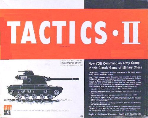
Tactics II from Avalon Hill. The first wargame I played. What was the first wargame you played?

Tactics II from Avalon Hill. The first wargame I played. What was the first wargame you played?

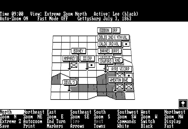
Over the years I would occasionally find someone interested in playing  (or, more likely, coerce a friend who really had little interest in wargames) to set up a game but rarely would we ever complete a full campaign or battle.  By the late 1970s playing wargames for me was a rare event (the one exception being my good friend from my undergrad college days, Corkey Custer). Then, about this time, I saw an episode of PBS’s NOVA on what was then the infancy of Computer Graphics (CGI). There, flickering on my black & white TV, was what we would eventually call ‘wire frame’ 3D. Wire frame 3D just shows the edges of 3D objects. They are not filled in with a texture (as CGI is done now). Computers just didn’t have the processing power to pull this off back in the late ’70s and ’80s. But, I immediately thought to myself, “this technique could be used to render 3D battlefields!” And that was the spark from UMS: The Universal Military Simulator was born.

Screen capture of the original UMS running in 640 x 400 x 2 resolution in MS DOS. This is an example of wire frame 3D.

Screen capture of the original UMS running in 640 x 400 x 2 resolution in MS DOS. This is an example of wire frame 3D.

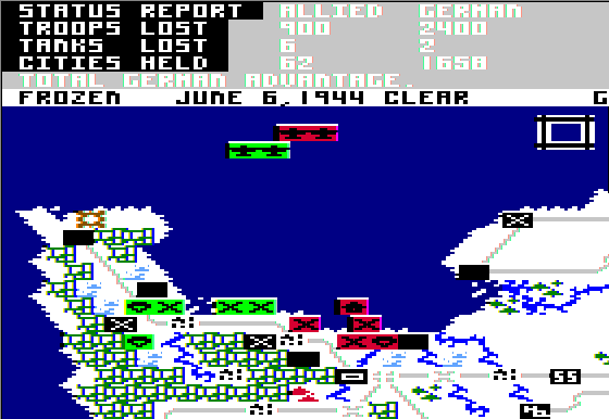
By the mid 1980s I was about to graduate with a bachelor’s degree in computer animation and, more importantly, a working demo of UMS. I had hypothesized that one of the biggest selling points of computer wargames was the ability to always have an opponent handy (the artificial intelligence or AI). I borrowed a copy of the Software Writers Market from the library and sent out dozens (maybe even hundreds) of letters and, eventually, papered an entire wall of my apartment with rejection letters from game publishers. But, Dr. Ed Bever, who designed Microprose’s Crusade in Europe, Decision in the Desert and NATO Commander (pretty much the only computer wargames that were out at the time) saw my pitch letter and gave me a call. Microprose wasn’t interested in publishing UMS per se, rather their CEO, “Wild Bill” Stealey, wanted me to come work for Microprose (and they would own UMS). That deal didn’t appeal to me but a short time later, at the 1986 Consumer Electronics Show in Chicago, Ed Bever introduced me to Microprose’s competitors, Firebird/Rainbird. Within 48 hours I had my first game publishing deal.

Crusade in Europe from Microprose (1985) designed by Dr. Ed Bever, originally programming by Sid Meir.

Crusade in Europe from Microprose (1985) designed by Dr. Ed Bever, originally programming by Sid Meir.

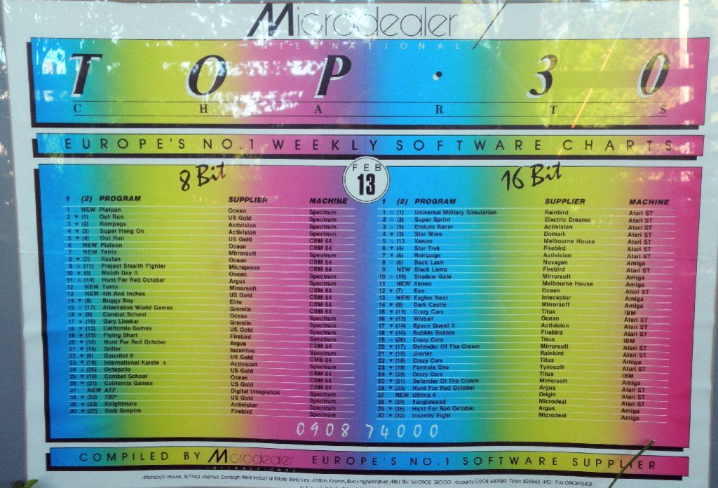
UMS sold about 128,000 units and was the #1 game in the US and Europe for a while.

The European Microdealer Top 30 Chart with UMS as #1 with a bullet on the 16 game chart. What other classic games can you find on the charts? (Click to enlarge)

The European Microdealer Top 30 Chart with UMS as #1 with a bullet on the 16-bit game chart. What other classic games can you find on the charts? (Click to enlarge)

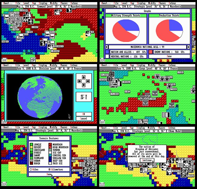
Ed Bever helped on the design of UMS II: Nations at War which was an extremely ambitious global wargame that had unprecedented detail and allowed the user to edit numerous variables and equations:

UMS II: Nations at War screen shots from the MS DOS version. Click to enlarge.

UMS II: Nations at War screen shots from the MS DOS version. Click to enlarge.

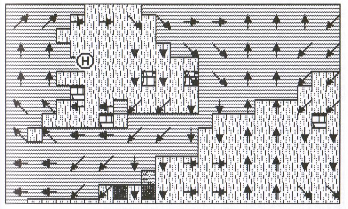
UMS II screen shot (Macintosh) showing active weather systems.

UMS II screen shot (Atari ST) showing active weather systems.

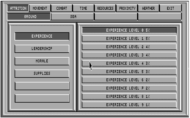
An example of the numerous variables that the user could adjust in UMS II. Click to enlarge.

An example of the numerous variables that the user could adjust in UMS II.; in this case adjusting the attrition level based on experience for ground units. Macintosh screen shot. Click to enlarge.

UMS II was named “Wargame of the Year” by Strategy Plus magazine and enjoyed strong sales. In many ways it was the ‘ultimate’ in complex wargaming.  It was far more detailed than any other wargame I’ve seen before or since (and that includes my work on DARPA, Department of Defense, US Army, Office of Naval Research and Modeling Simulation Information Analysis Center (MSIAC) wargames. Ironically, it was published by Microprose because they bought out Firebird/Rainbird and with it my publishing contract.

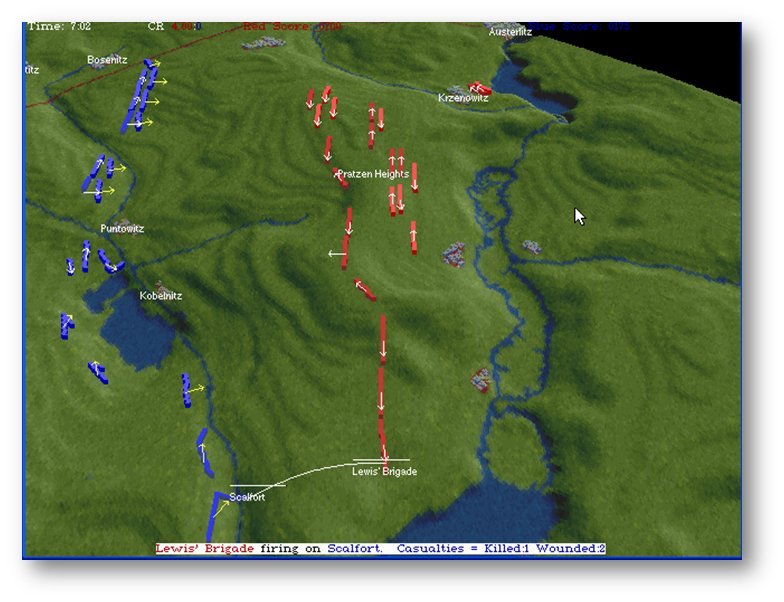
My next wargame, in 1993, was The War College.  We used data from US Geological Survey to create the 3D maps. Again, it was very detailed and allowed the user to edit combat values and featured an interactive hyperlinked history of each scenario (it shipped with Antietam, Austerlitz, Pharsalus and Tannenberg). Unfortunately, our publisher, GameTek, pretty much ceased to exist just as we were about to release this game. To this day I have no idea how many units it sold. We never got a royalty statement.

Screen shot (MS DOS) of the Austerlitz scenario in The War College. Click to enlarge.

Screen shot (MS DOS) of the Austerlitz scenario in The War College. Click to enlarge.

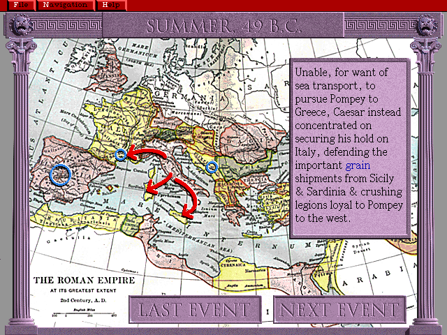
The War College also had an interactive history for each battle (screen shot from MS DOS, click to enlarge).

The War College also had an interactive history for each battle (screen shot from MS DOS, click to enlarge).

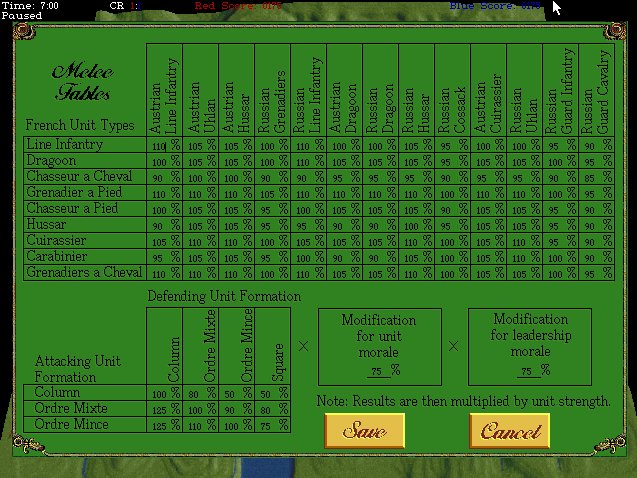
The War College allowed users to adjust melee effectiveness and values. MS DOS screen shot, click to enlarge.

The War College allowed users to adjust melee effectiveness and values. MS DOS screen shot, click to enlarge.

I also would be terribly remiss if I did not mention my good friends who worked on various ports of the above mentioned games, Ed Isenberg (Amiga and MS DOS), Andy Kanakares (Apple IIGS and MS DOS) and Mike Pash (MS DOS).

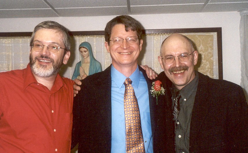
(left to right) Ed Isemberg, Andy Kanakares, Ezra Sidran. Not pictured; Mike Pash.

(left to right) Ed Isemberg, Andy Kanakares, Ezra Sidran. Not pictured; Mike Pash.

One of the problems of getting old is that your stories get longer to tell. This blog post is far longer than I intended and we haven’t even got to this century and all my research into computational military reasoning (Tactical and Strategic AI) and my new wargame, General Staff.  I’m afraid we’ll have to end this here and pick up the story in Part 2 next week.

2D or Not 2D That is the Question (Redux)

We have been going back and forth on the question of: should General Staff have a 2D or 3D battlefield? Arguments can be made on both sides. The key points for 3D are:

  • we already are storing all the necessary data (we know the height of every square meter on the battlefield)
  • we have topographical maps that we can use for the 3D texture
  • being in 3D may increase General Staff‘s popularity
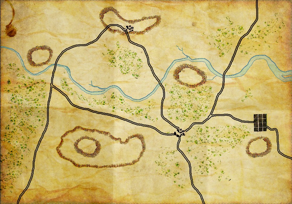
01TopographicalMap

A General Staff topographical map in 2D. (Click to enlarge.)

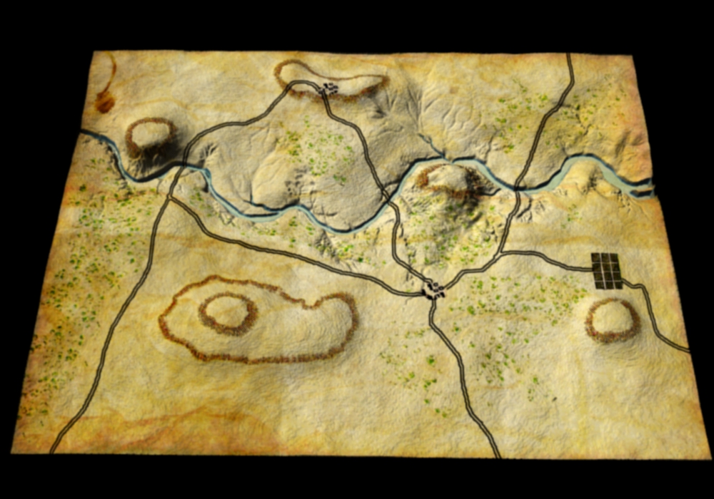
So, after going  back and forth on this issue for many months, we finally did some tests (thanks Ed Isenberg!). And here is what the same topographical map looks like utilizing our stored elevation data:

The same topographical map rendered in 3D. (Click to enlarge.)

The same topographical map rendered in 3D. (Click to enlarge.)

Well, it’s definitely 3D. But, it appears to me, that we’ve lost more than we have gained. The user hasn’t acquired any new information; hills, rivers, ridges and valleys were all quite apparent in the 2D map. We’ve also lost that wonderful historical Kriegsspiel feel of Victoriana typography and cartography. Our 3D display looks like a wrinkled pigskin and not a map that was used by the General Staffs of the great armies of the world. Also, not being in 3D will facilitate porting General Staff to smartphones.

We certainly would like to hear your opinion. But, as things stand now, General Staff will be moving forward in 2D.